CCCM Somalia Data Hub
How to read this data
methodology & data notes
This portal brings CCCM Cluster Somalia’s site information into one place for any humanitarian entity working on displacement — donors, cluster coordinators, UN agencies, NGOs and partner organisations. Every figure is computed live from the database — nothing on these pages is typed in by hand. This page explains where the data comes from, what each number means, and why a figure here can differ from a published PDF.
Community participation
Community members help identify site priorities, verify services and inform coordinated action.
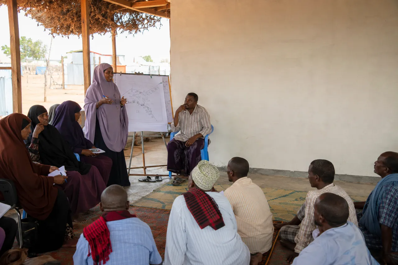
Illustrative context image. It does not represent the selected site or current field conditions.
Where the data comes from
- Site spine — Master List (2nd Quarter 2026, v6). The authoritative list of IDP sites (region, district, catchment, coordinates, household & individual counts). Every other view is anchored to a site on this list.
- KoboToolbox forms. Three live IOM forms feed the analysis — Site Monitoring (site conditions by sector), Service Mapping (which services are available and by whom), and Incident Reporting (floods, evictions, fires and other shocks).
- Flooding & geography. A flood-exposure layer plus Somalia admin boundaries, catchments and river basins (Juba & Shabelle) provide the environmental context.
Data refreshes automatically from KoboToolbox. For current record counts and the last sync time, see Reports → Data quality.
Two views of service coverage — and which to cite
The Service mapping module has two tabs. Use the right one for the right question:
- Map — an interactive map to explore where services sit and where the gaps are, coloured by coverage per district. Best for exploration.
- Availability report — the published availability figures and provider rosters, computed from the CCCM Service Mapping form. Cite this tab for official availability percentages.
Site monitoring works the same way: Overview is the live dashboard; Severity report is the report-faithful view that reproduces the published severity analysis.
What the colours and scores mean
Indicator status (traffic light)
A site’s Severity Score is the mean red-rate across the sectors assessed at that site — the more indicators are Red, the more severe. Sites are then banded (e.g. low / moderate / high / critical) to prioritise attention.
Service gap = the share of sites without a given service. Flood risk bands come from the flooding layer. Incident severity is a 0–100 score combining loss of life, displacement, shelter and infrastructure damage, services lost and hazard level.
Why a figure here can differ from the published PDF
The quarterly PDF reports were produced on a fixed date using a hand-verified subset of sites (a quarter date-filter plus name-verification exclusions). This portal instead computes from all matched sites, using each site’s most recent assessment. So a headline percentage can differ from the PDF’s — but the indicator rankings and per-sector gaps still align. Each report view states its own site count and this caveat inline, so you always know exactly which sites a number is built from. We disclose the difference rather than force a match.
Geographic scope
The Scope bar at the top lets you pick a region or district once; the analytical views then filter to it. It applies to Home, Executive summary, Needs & gaps and Geographic analysis. The report-faithful Availability report, Severity report and the Incidentsmodule stay national, because they reproduce national published analyses. Clear the scope to return to all of Somalia.
Privacy & data protection
This is a public portal, so personal data is removed before it ever reaches the browser or an export: no enumerator names or phone numbers, no KoboToolbox submission IDs, URLs, tokens or submission GPS metadata. Organisation names are shown — they support accountability and are not personal data. Scrubbing runs both when data is ingested and again before any download.
Data quality & verification
Sites that could not be matched cleanly to the Master List are kept (never dropped) and routed to a verification queue, where they are linked to the authoritative site code. The cleaning pipeline flags rather than deletes questionable records, so nothing is lost silently. Match status and data-quality metrics are visible to cluster staff under Reports and Verification.
Questions on methodology can be directed to the CCCM Cluster Coordination team. This page describes how the data is processed; the underlying figures always come from the live database.